The Basics
Learn Data Visualization for fun and profit! Data isn’t useful without a way to visualize it. In the Information Age, your ability to present compelling data is an asset worth sharing. We’re dealing with an assault on our senses with the sheer amount of data coming our way.
Data Visualization is often an art form though there are ways to pick the best widget.
Primary Use Cases
Why would you want to visualize data?
- You’re presenting quarterly results to your pointy-haired boss
- You want to be data-driven
- You’re trying to sell an idea
Know Your Audience
A succinct Venn diagram will quickly hammer your point home, but it won’t help you tell a lengthy story. Ask yourself these questions before building your visualizations.
- What questions does your audience need to answer?
- How far does your audience want to go down the rabbit hole?
Before creating your data visualizations, take the time to interview your audience to learn which stories are most important to them.
Know Your Goals
Do you want to convince your stakeholders to invest in performance improvements? Are you trying to convey sales information?
Knowing what you are trying to accomplish is a great habit in life, and it is paramount to your success when building data visualizations.
Defining key performance indicators will increase the impact of your data visualization efforts. If your goal is to convince investors to give you money, one of your KPIs would be a signed check.
Choose Your Weapon
Many data visualization widgets exist. Picking the right visualization can be challenging. Most ideas can be conveyed with a few basic charts and a little finesse.
Here are five of the most common widgets used for data visualization.
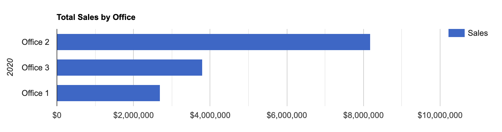
Bar Chart
A bar chart or bar graph is a chart or graph that presents categorical data with rectangular bars with heights or lengths proportional to the values that they represent. The bars can be plotted vertically or horizontally. A vertical bar chart is sometimes called a column chart.
Example
<div id="chart_bar_div"></div>
<script type="text/javascript">
google.charts.load('current', {packages: ['corechart', 'bar']});
google.charts.setOnLoadCallback(drawBasic);
function drawBasic() {
      var data = google.visualization.arrayToDataTable([
        ['Office', 'Sales',],
        ['Office 2', 8175000],
        ['Office 3', 3792000],
        ['Office 1', 2695000]
      ]);
      var options = {
        title: 'Total Sales by Office',
        vAxis: {
          title: '2020'
        },
        hAxis: {
        	format: '$#,###,###'
        }
      };
      var chart = new google.visualization.BarChart(document.getElementById('chart_bar_div'));
      chart.draw(data, options);
    }
</script>
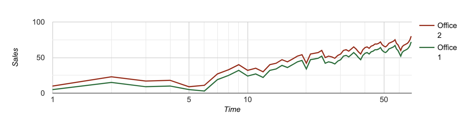
Line Chart
A line chart or line plot or line graph or curve chart is a type of chart that displays information as a series of data points called ‘markers’ connected by straight line segments.
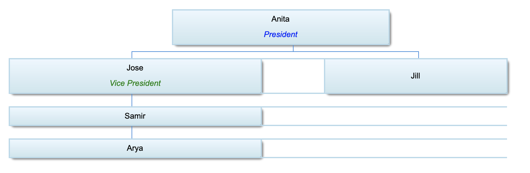
Flow Chart
A flowchart is a type of diagram that represents a workflow or process. A flowchart can also be defined as a diagrammatic representation of an algorithm, a step-by-step approach to solving a task. A flowchart is the superset of an org chart, which is a common flowchart.
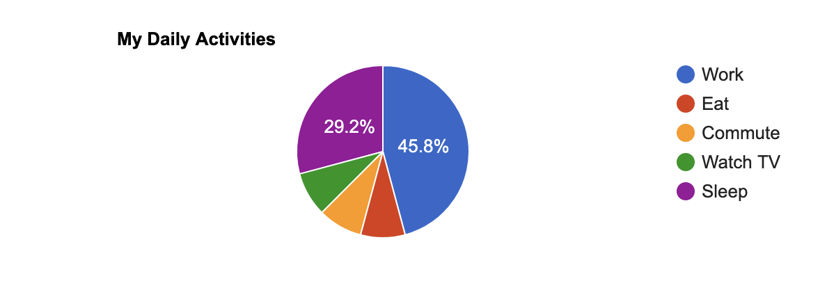
Pie Chart
A pie chart - or a circle chart) is a circular statistical graphic divided into slices to illustrate numerical proportions.
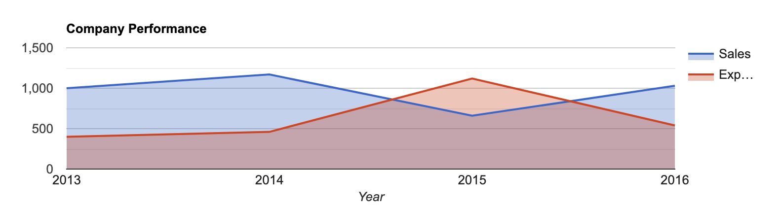
Area Chart
An area chart or area graph displays graphically quantitative data. It is based on the line chart. The area between axis and line is commonly emphasized with colors, textures, and hatchings. Commonly one compares two or more quantities with an area chart.
Color Your Theory
Use color theory to pick an appropriate color scheme that will bring your visualizations to life.
Try using a color palette generator to kickstart your journey with color theory.
Learn Data Visualization - Beyond the Basics
Videos
- Data Visualization: Best Practices - LinkedIn
- Data Visualization: Best Practices - Pluralsight
- Communicating With Data - Udemy
- Telling Stories with Data - Udemy
- Color Theory Fundamentals - Pluralsight
Books
- Stories That Stick - Amazon
- Effective Data Storytelling - Amazon
- Killer Visual Strategies - Amazon
- Effective Data Visualization - Amazon
- Design Elements, Color Fundamentals - Amazon
References
The Data Visualisation Catalogue - Inspiration