The Basics
Learn Color Theory for fun and profit! Do you like math, art, and the pursuit of balance? If so follow along as the highlights of Color Theory are revealed.
Primary Use Cases
- Communicate effectively with your audience
- Super-charge the aesthetics of your design project
- Add harmony to your creations
- Data visualization in diagrams, chart, and graphs
Use The Right Tool
Color theory provides a couple of primary ways of managing your color.
CMKY
The Cyan, Magenta, Yellow, and Black (CMYK) color model is a subtractive color model, based on the CMY color model, used in color printing, and is also used to describe the printing process itself.
Use the CMKY color model when printing data visualizations
RBG
The Red, Blue, and Green (RGB) color model is an additive color model in which red, green, and blue light are added together in various ways to reproduce a broad array of colors.
Use the RBG color model when presenting on digital displays
Definitions in Color
Let’s start with some definitions.
Color
The property possessed by an object of producing different sensations on the eye as a result of the way the object reflects or emits light.
Hue
The most noticeable color that stands out to the eye, or the dominant color
Value
Lightness or darkness is of a color relative to others around it. The lightness or darkness of a hue. The closer to black the lower the value
Tint
A hue plus a value.
Shade
A hue plus black.
Tone
A hue plus gray.
Saturation/Chroma
Saturation is the state or process that occurs when no more of something can be absorbed, combined with, or added. As black, white, or grey are adding to a pure hue, the hue’s brilliance becomes neutralized.
Primary Colors
Primary colors are any group of colors from which all other colors can be obtained by mixing. Primary colors cannot be created by combining any other colors. If you combine the top range of RBG, you will end up with white. You can think of them as prime numbers. A prime number cannot be created by multiplying two numbers together.
Secondary Colors
A secondary color is a result of combining equal parts of two primary colors.
Tertiary Colors
A tertiary color is produced by an equal mixture of a primary color with a secondary color adjacent to it on the color wheel.
Color Temperature
Color temperature is a powerful method of communication with color.Absolute Warm: Yellows, oranges, and reds Absolute Cold: Blues Color temperature is relative to the colors around it. Red is warmer than yellow. Blue is colder than cyan.Colors opposite on the color wheel are warm and cold respectively
Color Schemes
Color Schemes or color palettes are the choices of colors used in various artistic and design contexts. It’s difficult to learn color theory without an understanding of color schemes. If you are excited and want to get started with color theory, try out Adobe’s Color Wheel application.
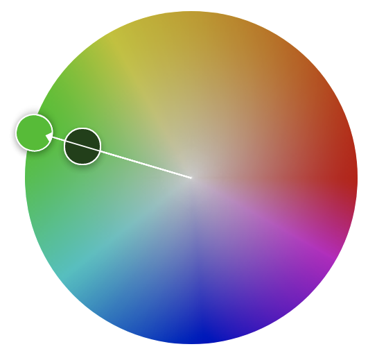
Monochromatic
Monochromatic colors are all the colors (tints, tones, and shades) of a single hue.
Complementary
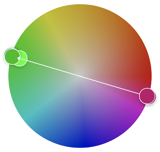
Complementary colors are for the mixing of colored light, Newton’s color wheel is often used to describe complementary colors, which are colors that cancel each other’s hue to produce an achromatic (white, gray or black) light mixture.
Split-Complementary
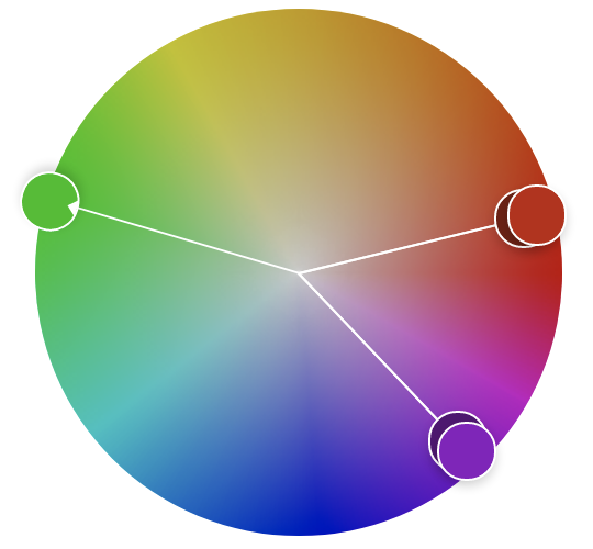
Split-Complementary colors are a three-color combination consisting of a base color and two colors that are 150 degrees and 210 degrees apart from the base color.
Double Split Complementary
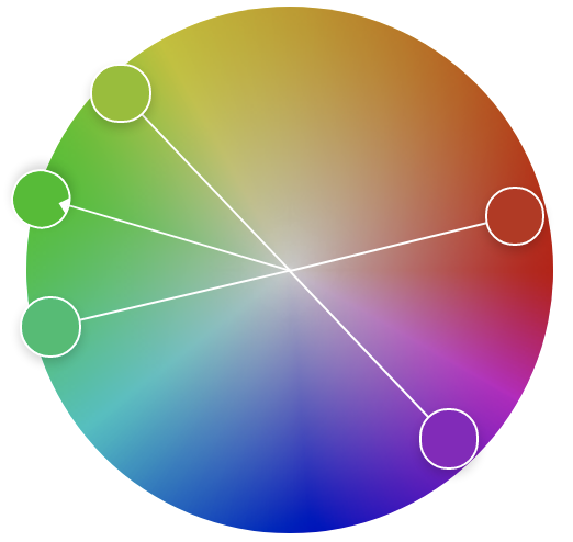
A double complementary scheme is when two hues (colors) are next to each other on the color wheel and are paired with two adjacent hues on the opposite side. This overall creates a color palette of four hues that are adjacent but opposite such as blue-green, blue, orange, and red-orange.
Achromatic
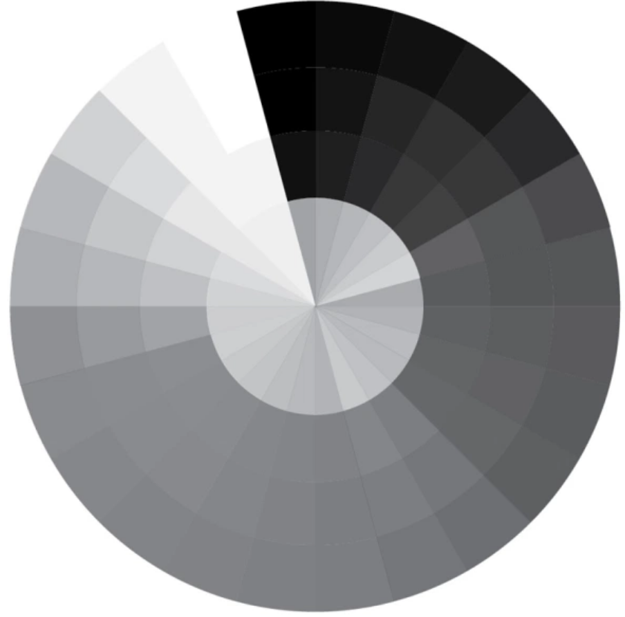
Achromatic colors lack strong chromatic content and are said to be unsaturated, achromatic, or near neutral.
Analogous
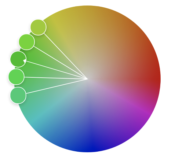
Analogous colors (also called Dominance Harmony) color scheme are groups of colors that are adjacent to each other on the color wheel, with one being the dominant color, which tends to be a primary or secondary color, and two on either side complementing, which tend to be tertiary.
Triadic
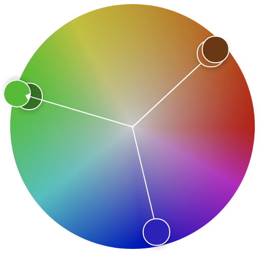
Triadic colors are a three-color combination consisting of a base color and two colors that are 120 degrees and 240 degrees apart from the base color.
Color Scheme Definitions
With a view of color schemes under our belt, we can learn color theory further with color scheme definitions.
Analogous Palettes
Analagous palettes are colors that are next to each other on the color wheel. These colors are connected by a common trait and instill a sense of calming harmony with related hues.
Harmonious Palettes
Harmonious colors are natural variations of similar colors that create a calming sense of harmony.
Monochromatic Palettes
Monochromatic palettes use variations of a single hue. This palette is calming, minimalist, and visually unobtrusive. Ensure there is enough difference in the value between colors for the best results.
Conclusion
Learning Color Theory is required for graphics designers, print designers, and other professions presenting data in color to convey a message. If you’re a technology professional, learning color theory will help you get your point across more effectively. It might even give you an art appreciation. 🎨
Learn Color Theory - Beyond the Basics
Videos
- Color Theory Fundamentals (Pluralsight)
- Graphic Design Foundations: Color (LinkedIn)
- The Beginner’s Guide to Color Theory for Digital Artists (Udemy)
- Color Theory: The Mechanics of Color Applied and Theoretical Color (The Gnomon Workshop)
Books
- Design Elements, Color Fundamentals (Amazon)
- How Color Works: Color Theory in the Twenty-First Century (Amazon)
